Process
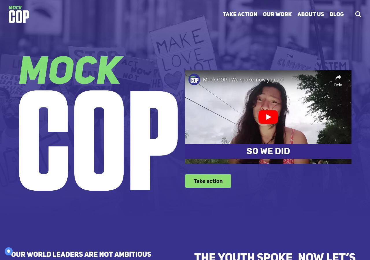
I worked with Mock COP to completely revamp their website. The old site was difficult to edit, slow and most importantly lacked an accurate portrayal of the youth led power of the campaign.
I completely redesigned the website with that in mind, to use Mock COP’s existing colours and typefaces to deliver the most punch possible and to stay true to their message. Large title sizes, white-on-blue page colours along with images all help in delivering that.

On the tech side, staying with WordPress was the easiest option, for migrating content, and for its ease of use for editors. I developed several custom Gutenberg blocks and used Twig for templating, with the excellent Timber plugin, separating templating from the PHP logic.